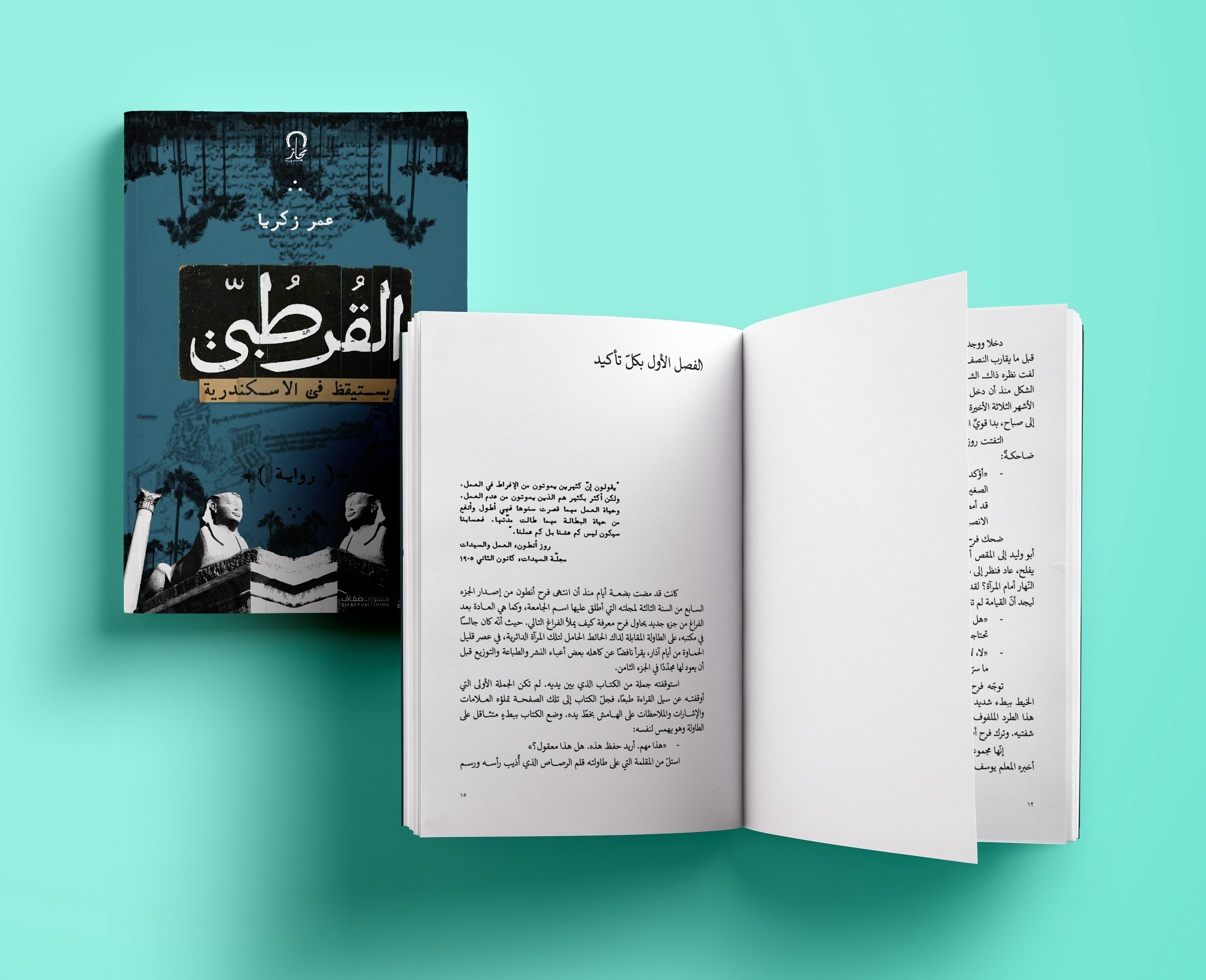
The novel Al-Qurtubi Wakes in Alexandria by Omar Zakaria vividly depicts the intellectual struggles of the Arab Nahda at the turn of the twentieth century. Set in Cairo and Alexandria, it follows a diverse cast of thinkers and writers as they navigate debates about modernity, philosophy, religion, science, and the press. Through their interactions, the book brings to life cultural and ideological currents shaping the region’s transformation.
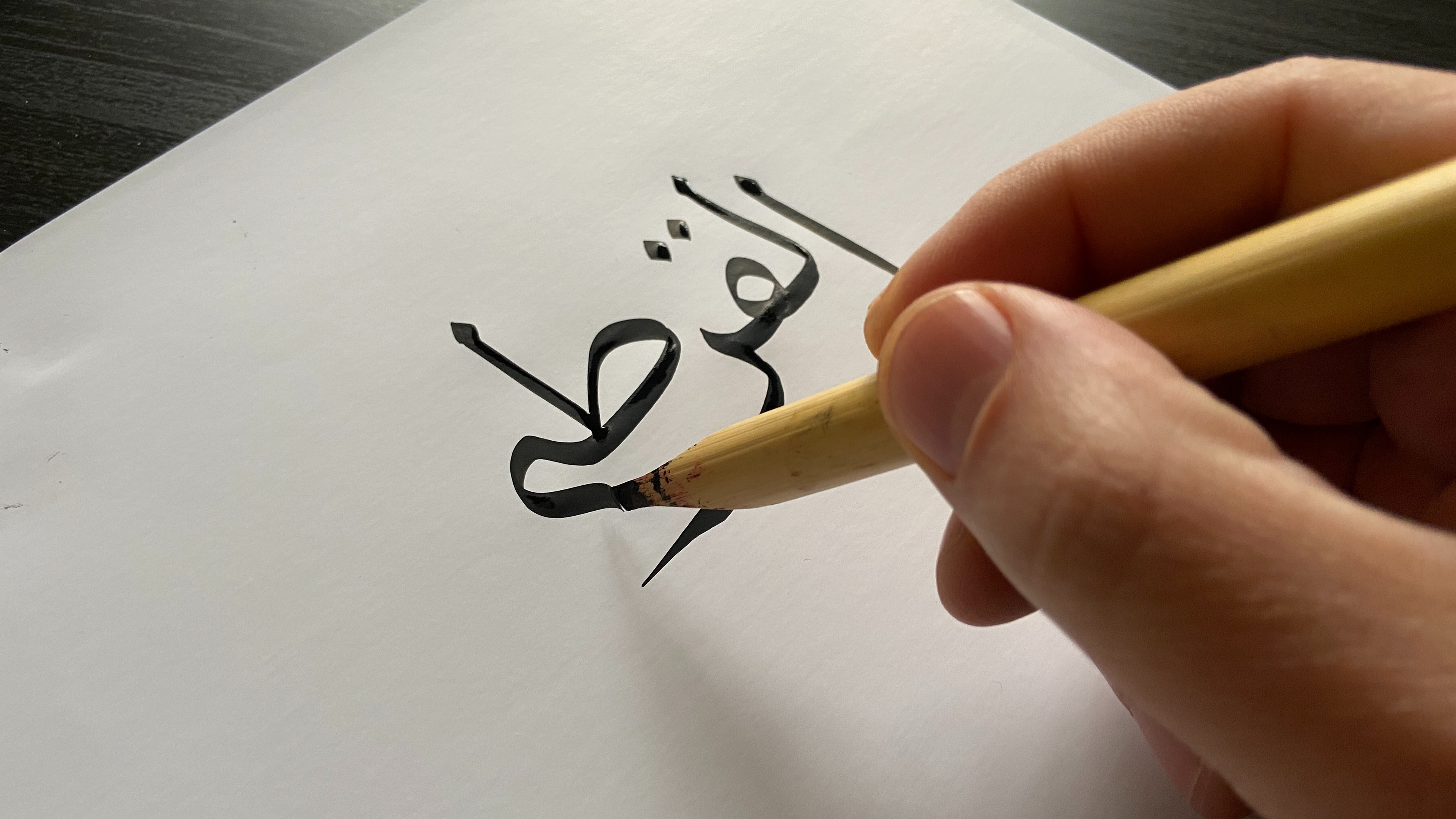
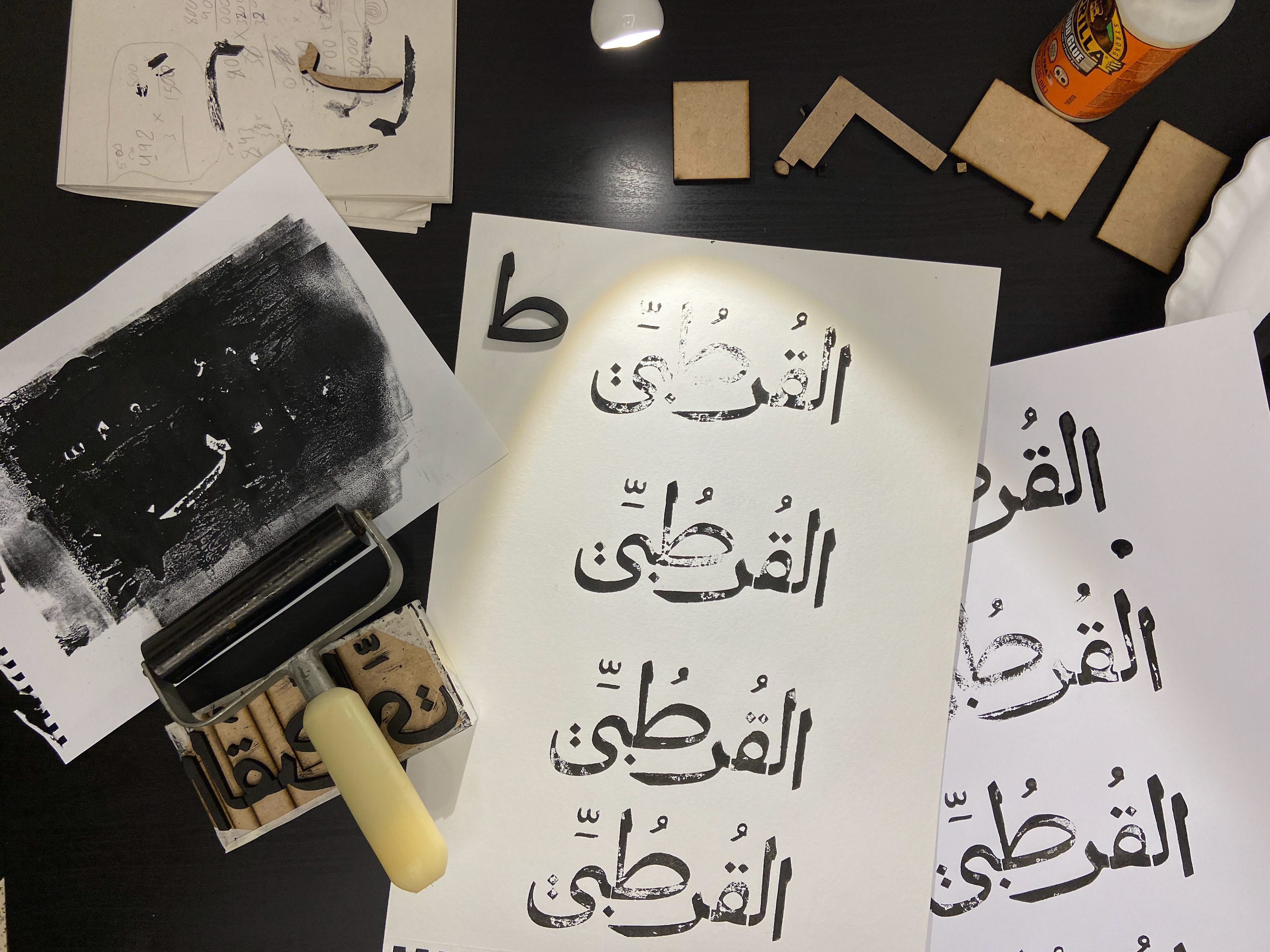
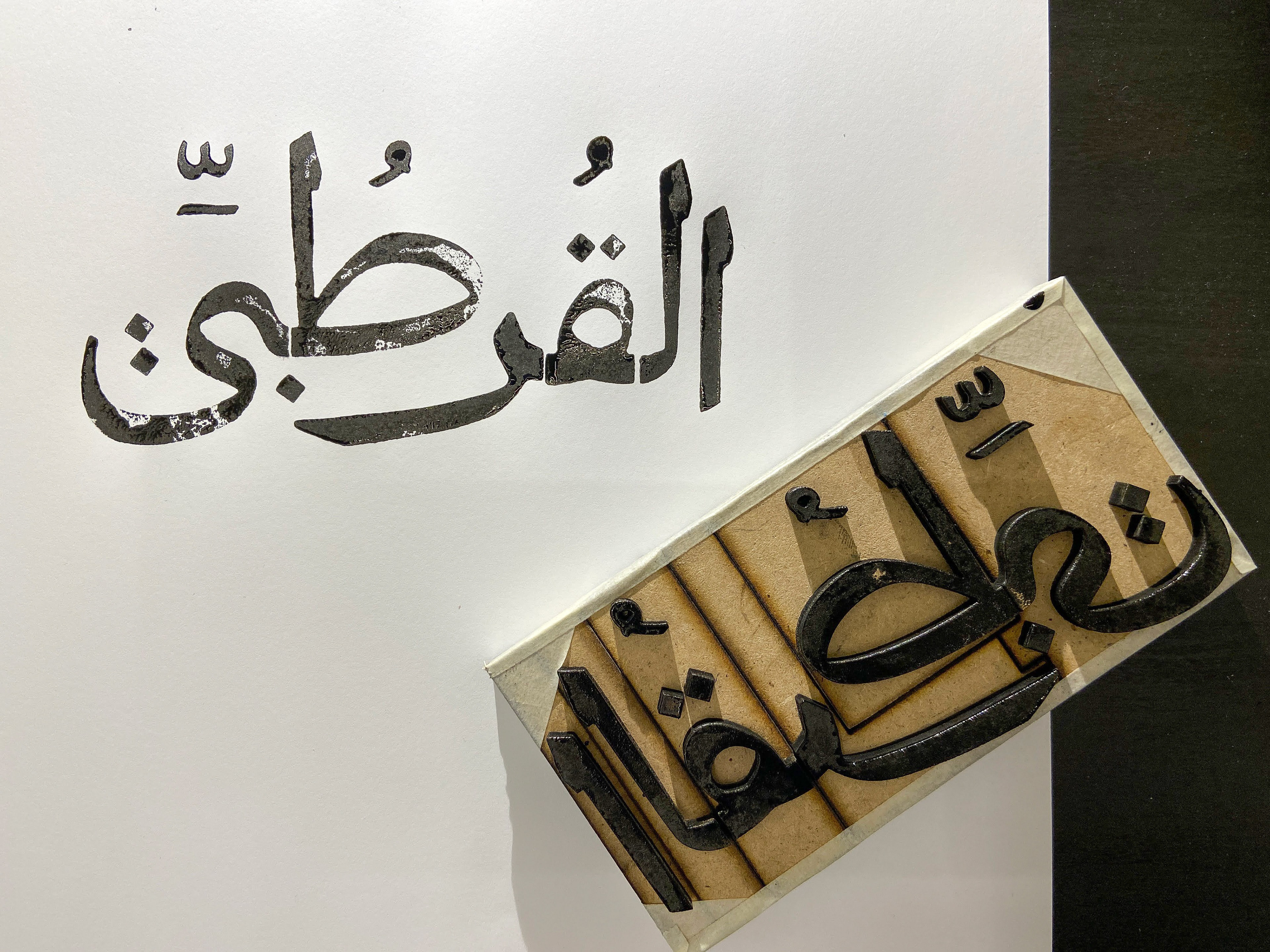
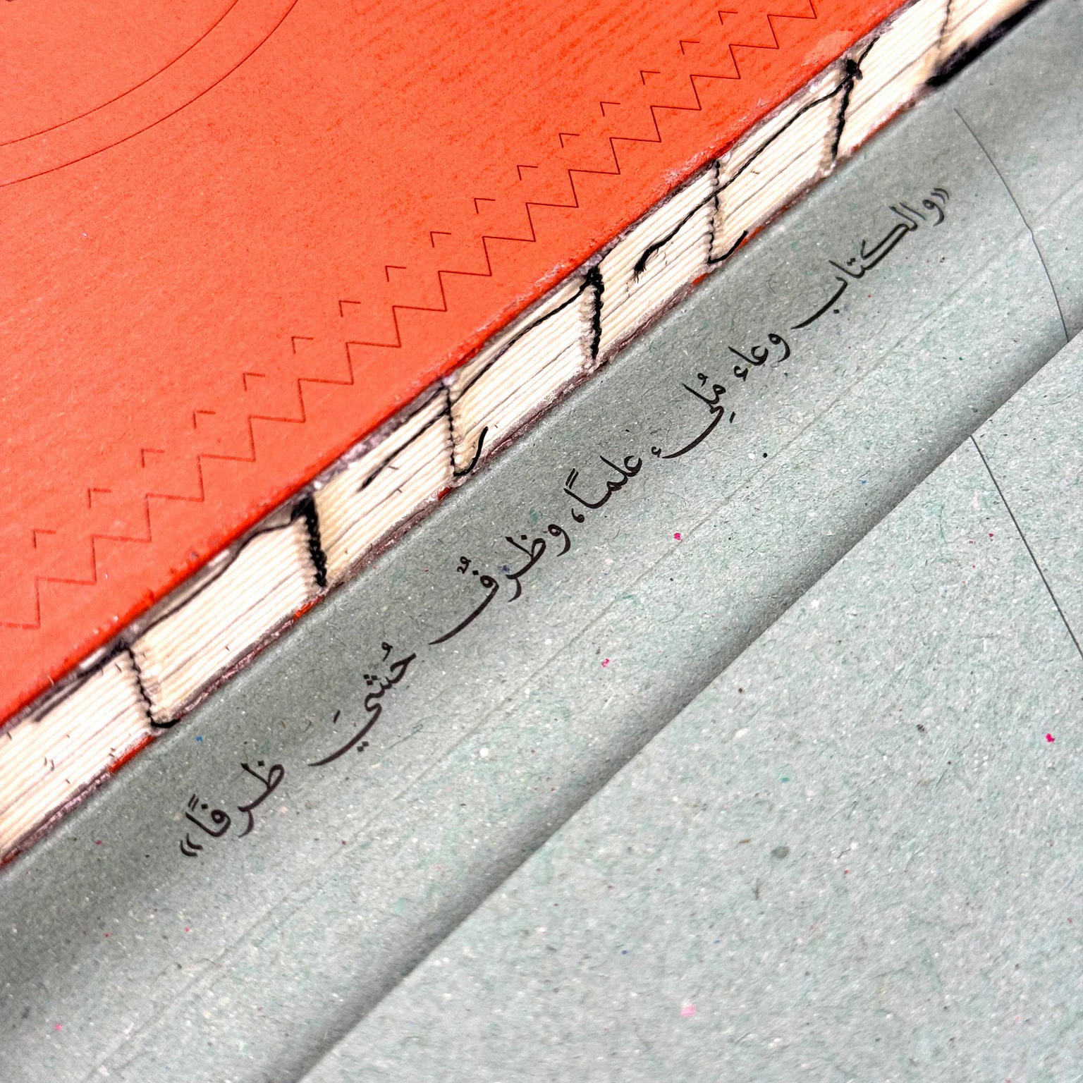
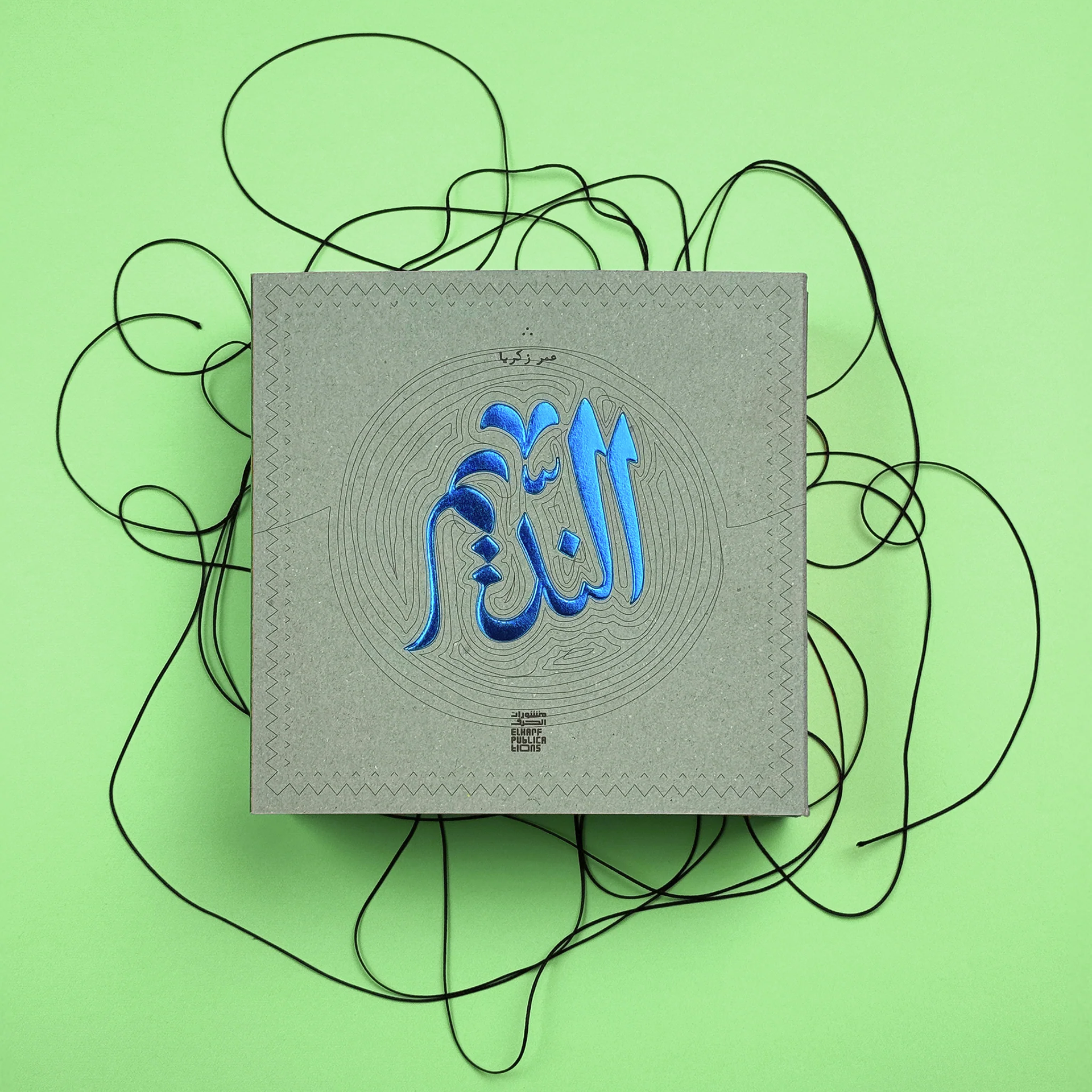
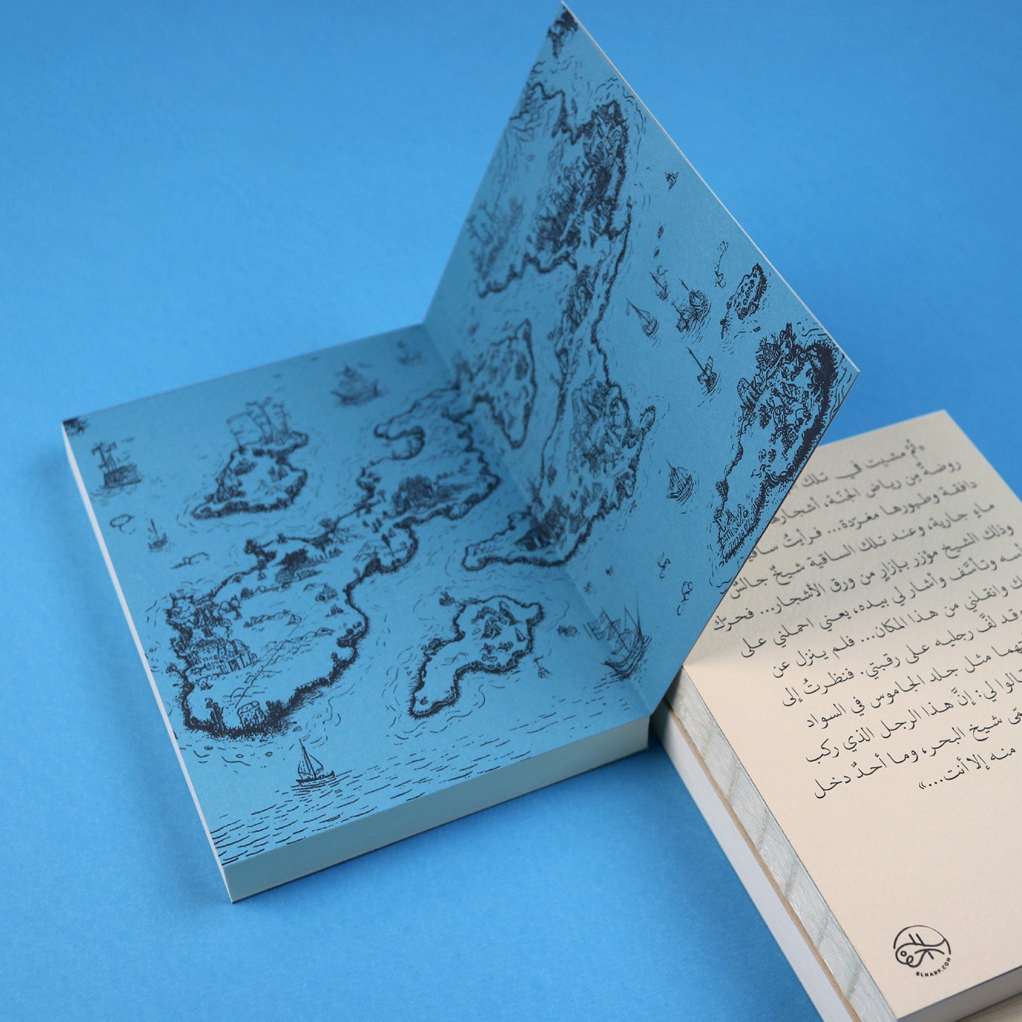
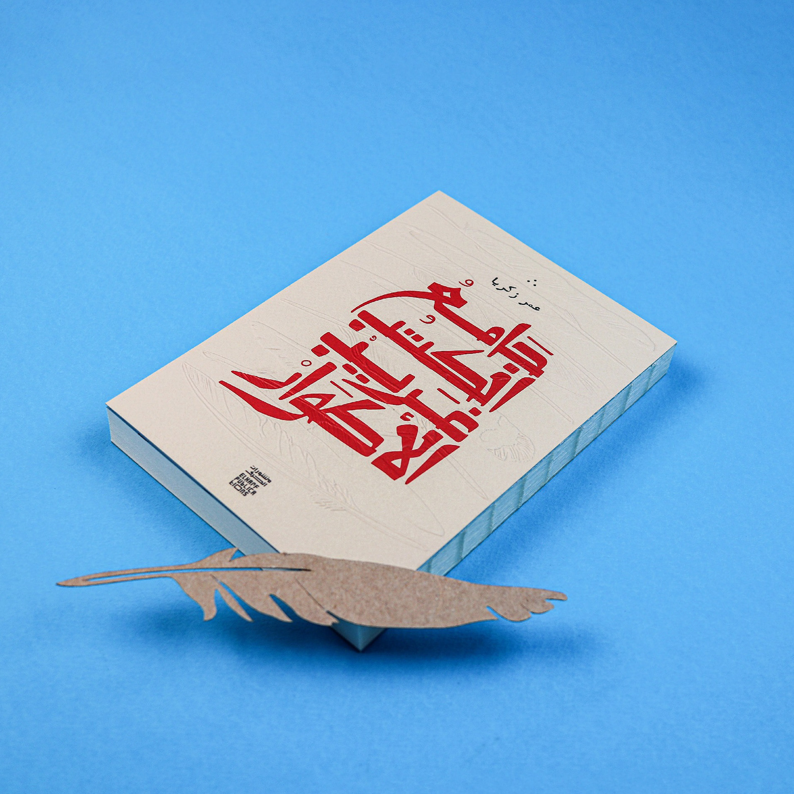
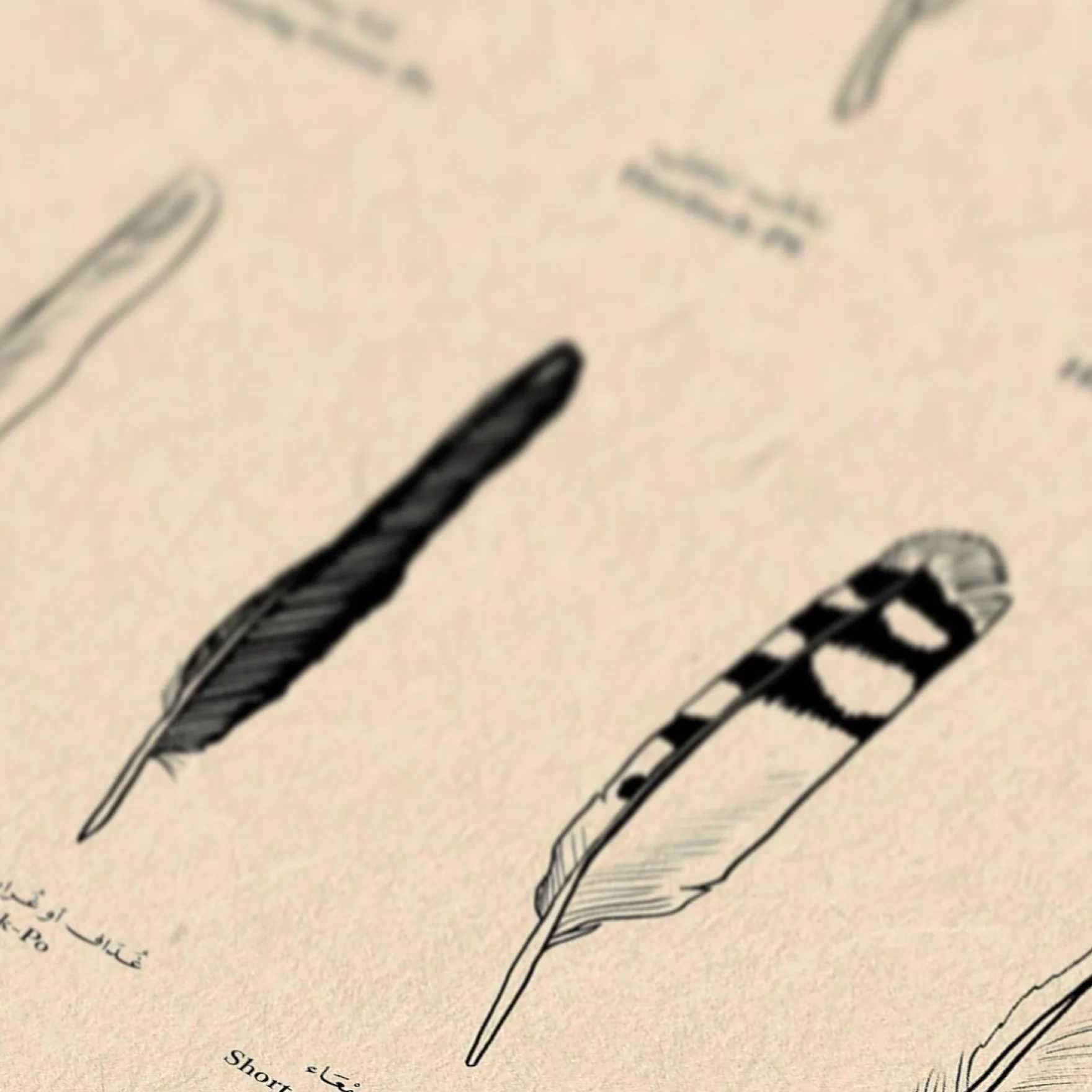
We designed the cover and interior layout for Omar Zakaria’s debut novel, a work of historical fiction set in Egypt in 1902 and inspired by the intellectual figures and events of that period. Drawing on this context, we adopted the aesthetic of movable woodblock type to echo the production of newspaper headlines in late nineteenth-century Egypt and the wider Middle East. The body text is set in Sakkal Kitab, the award-winning typeface by Dr. Mamoun Sakkal, while quotations use our own ALAZAAT Font: Kateba, an Arabic typewriter-inspired font. The project also features a selection of illustrations by Jordanian artist Firas Majzoub, created specifically to accompany key moments in the novel.
More about the book and the design story (In Arabic): https://alazaat.wordpress.com/2021/12/28/al-qurtobi/
Category : Historic Fiction
Language : Arabic
Publisher : منشورات ضفاف
Designer: ALAZAAT Studio
ISBN : 9786140218550
Release Date : 24 Dec 2020
Pages : 234
تقدم رواية «القرطبي يستيقظ في الإسكندرية» لعمر زكريا سردًا روائيًا غنيًا يصور صراعات النهضة التنويرية في أواخر القرن التاسع عشر وبدايات القرن العشرين. تدور الأحداث في القاهرة والإسكندرية بين مهاجرين وشوام ومثقفين يسعون لصياغة علاقة جديدة بين الفلسفة والدين، وتسلّط الضوء على حوارات ثقافية وفكرية حول العلمانية والحداثة والصحافة العربية، مستحضرة تحولات معرفية واجتماعية عميقة في الشرق.
شاركنا في هذا العمل بتصميم الغلاف وتخطيط الصفحات الداخلية للرواية الأولى للكاتب عمر زكريا. تتناول الرواية سردا تخييليا لشخصيات فكرية وأحداث دارت في مصر عام 1902. وانطلاقا من هذا السياق التاريخي، جاءت فكرة اعتماد أسلوب الطباعة بالحروف الخشبية المتحركة، محاكاة لأسلوب إنتاج العناوين الصحفية في أواخر القرن التاسع عشر في مصر ومنطقة الشرق الأوسط.
اعتمدنا في متن النص خط "صقال كتاب"، وهو خط حائز على جوائز من تصميم الدكتور مأمون صقال، بينما استخدمنا في الاقتباسات خطنا الخاص "كاتبة"، وهو خط عربي مستلهم من الآلة الكاتبة. كما دعونا الفنان الأردني فراس المجذوب للمشاركة في العمل من خلال مجموعة من الرسوم التوضيحية التي أنجزها خصيصا لتواكب بعض مقاطع الرواية وتنسجم مع عالمها السردي.
للمزيد عن الكتاب وقصة التصميم باللغة العربية:
https://alazaat.wordpress.com/2021/12/28/al-qurtobi/
https://alazaat.wordpress.com/2021/12/28/al-qurtobi/